In part 1, we discussed the emergence of wellbeing statistics as one way to track economic performance. Here we look at more pragmatic measures, all of which retain some link back to GDP.
A measure of inclusive growth or ‘good’ growth
One approach is to construct a single estimated figure for ‘good’ economic performance by combining a number of measures into one simple comparable metric.
For example, the Centre for Progressive Policy recently introduced two inclusive growth measures. One for country comparisons and the other for UK local authority analysis. Their measure combines data on consumption, life expectancy, leisure, inequality and unemployment to produce an inclusive growth score for each local authority or country. This is a complex but impressive piece of work.
PWC have developed a similar – albeit more straightforward – index for cities. Whilst the Good Economy organisation have developed one for Scotland.
In short, what this approach attempts to do is to ‘stick together’ different indicators of ‘good’ indicators of economic progress.
This approach takes head-on the challenge that GDP only measures economic output and nothing else, and it gets around the lack of clarity issue that can sometimes be a challenge for the dashboard approach by consolidating everything into one or two simple numbers.
But there are some challenges with this overall approach and care needs to be taken when they are being developed.
First of all, whatever indicators are chosen to include in this inclusive growth pot are subjective and would vary across users.
Secondly, any weight given to each indicator will also be subjective.
Finally, a lot of indicators such as the youth employment rate have large confidence intervals and so by adding it up with a group of other indicators – all with large confidence intervals – the result is a number which has minimal statistical significance and which makes meaningful interpretation very difficult.
We have developed our own metric to highlight some of the susceptibility that results have to slight subjective changes. Our approach is similar to that used in the Scottish Government’s social security agency central functions location analysis.
We chose Aberdeen City, Dundee, Edinburgh, Falkirk, Glasgow, Highland, North Ayrshire, Perth & Kinross, Scottish Borders and Stirling to be ranked against different indicators with the aim of resulting in a, one figure, metric for each local authority that would allow them to be ranked against the other nine.
To do this we use the most recently available data on the indicators outlined below –
Table 1: Indicators used in our metric measure with sources and year used

An issue with building a measure like this is that you have a trade-off between having the most recent data on these indicators, that are inconsistent with each other, and using earlier estimates which doesn’t help inform policy-making today. We went for the most recent data.
We awarded a score to each city dependent upon their points for each indicator.
We examine five variations of this measure:
Table 2: Weights assigned to each indicator for each measure
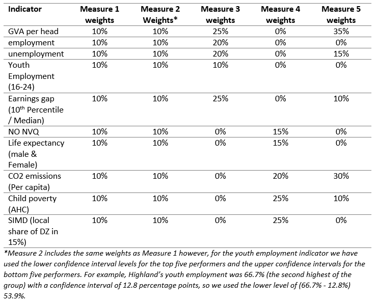
For all measures, the rankings vary depending on the weights and whether confidence intervals are accounted for or not.
Table 3: Performance of each local authority under each measure, rank from best (1st) to worst (10th)
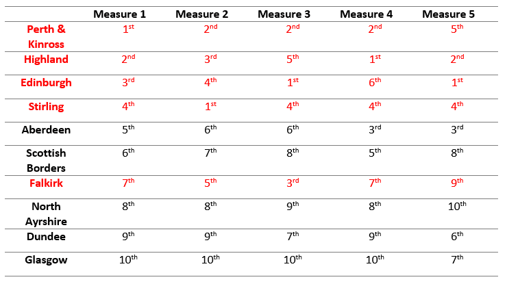 Source: FAI calculations
For instance, Falkirk scored as low as 9th in Measure 5 but 3rd on Measure 3.
Similarly, Edinburgh fluctuated from 6th to 1st across measures. So when referring to Measures 3 and 5, local authorities such as the Highlands should aspire to be more like Edinburgh, however in the case of Measure 4, Edinburgh should perhaps seek to replicate the Highland’s approach.
Additionally, the difference between Measures 1 and 2 highlight the importance of confidence intervals. In Measure 2 Stirling jumps from 4th to 1st place because we included its upper confidence level instead of its central estimate.
A dashboard
The so called dashboard approach pulls together a range of indicators that each capture objectives that a society is trying to improve. These could be measures of inequality, reductions in pollution levels, household incomes, falling crime rates etc.
This is the approach adopted in the National Performance Framework (NPF). Back in 2007, this was a ground-breaking development that attempted to shift the focus away from looking at ‘inputs’ to ‘outcomes’. So rather than focus upon metrics such as the number of nurses employed or how much money is spent on the NHS (i.e. inputs), the aim would be track performance on indicators such as healthy life expectancy and/or reductions in mortality rates for key illnesses etc. (i.e. outputs).
Such an approach clearly has a number of advantages.
What goes into each dashboard will vary from country to country depending upon their own values and priorities. It is transparent and can help show any synergies and trade-offs that can emerge from time-to-time. It can also give a comprehensive indication of a nation’s progress, which can be updated on a regular basis as and when new information becomes available.
But it also has some disadvantages. Chief amongst these is usability. A large dashboard of indicators necessarily includes a wide variety of objectives – the current NPF has 81 national indicators.
Ultimately, such a broad focus can make it hard to pin-down the areas where policymakers can have an impact. Indeed, to what extent has the NPF really changed the way we think about policy in Scotland, or how we are doing as a country?
Policymakers – on all sides – still talk in terms of ‘number of nurses’, ‘number of police officers’ etc and use phrases like ‘pass on all Barnett consequentials to the health budget’.
Towards a better approach?
For all its challenges, the best approach is still likely to be some form of dashboard as first developed in the National Performance Framework.
A streamlined version, and one that focusses upon a small number of objectives – which can change over time depending upon the economic climate or wider socio-economic conditions – is likely to be preferable.
ONS regularly publish one for the UK as a whole already.
It would be interesting to see the Scottish Government publish something similar to rival its quarterly GDP publication.
Of course, what could go into such a basket of indicators can – and arguably should – change over time depending upon the context and political priorities.
This could then be the focus of government policy each year, including the Budget.
Authors
The Fraser of Allander Institute (FAI) is a leading economy research institute based in the Department of Economics at the University of Strathclyde, Glasgow.