
One of the most surprising trends in the UK labour market since the start of the lockdown at the end of March is that – so far – falls in overall employment have been limited. The employment rate of those aged 16-64 between April and June 2020 was 76.4%, down only 0.2 percentage points (a fall of 59,000) on the first quarter of 2020. For now, the working age employment rate remains significantly above the rate of 70% seen in the aftermath of the global financial crisis.
More surprisingly still, there was no sign of any fall in the working age employment rate on a monthly basis, with the rate for June 2020 above that of the previous few years (see chart).
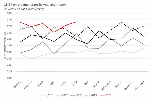
As ever, there are important subtleties to this picture when you start looking under the bonnet. By age, for example, the fortunes of younger and older workers have been less positive. Employment of those aged under 25 declined by 100,000 between Q1 and Q2 2020. There was also a relatively large fall in employment of those aged 65+ (of 161,000) which means the 16+ employment rate fell by half a percentage point on the quarter.
There is also a big difference between employees and the self-employed. Between Q1 and Q2 2020 the number of self-employed declined by a stunning 5%, or 238,000. This is partially offset by a small rise in employees. This trend stands contrasts with the experience of the financial crisis when self-employment held up relatively strongly and then rose quite rapidly in the aftermath of the crisis.
Of course, the main reason why the fall in employment have not been larger, is that the Job Retention Scheme (JRS) has enabled people to remain in employment, with their earnings topped up fully or partially by the Government, whilst working zero hours.
Given this, total hours worked gives us a better measure of how much activity is happening in the economy than the employment rate, and the distribution of those hours across different job and worker characteristics gives a sense of the implications of the lockdown on an individual level.
Our ongoing project, funded by the Standard Life Foundation, is looking at how patterns of working hours have been changing for different groups of workers over the past 20 years.
As part of that project, this article looks at how the pattern of hours worked evolved during the second quarter of 2020 – the ‘lockdown’ – focussing on the implications for different types of occupation. It draws on the most recent Labour Force Survey (LFS) data covering the period up until June 2020, and focusses on hours changes amongst employees (hours changes among the self-employed is a story for another day).
Furloughing and the rise of ‘zero hour’ weeks
Although the number of employees increased slightly between the first and second quarters of 2020, the number of hours worked each week by employees dropped 16%, from 876 million to 731 million.
This fall in total hours worked was driven almost entirely by a rise in the proportion of employees who worked zero hours in the ‘reference week’, i.e. the week that they were asked to describe their employment situation.
A fall in total hours worked could also be accounted for by a change in the number of people in employment, or a change in average hours worked by those who worked positive hours in the reference week – but as we show below, these two factors are relatively unimportant at an aggregate level.
In normal times, around 9% of employees work zero hours in a given week. An employee might work zero hours if, for example, they were on annual leave, sick or unwell, on maternity or paternity leave, or taking some other form of leave.
But in April and May 2020, around one quarter of employees worked zero hours. This is about 15 percentage points higher than is typically observed in those months (see chart).
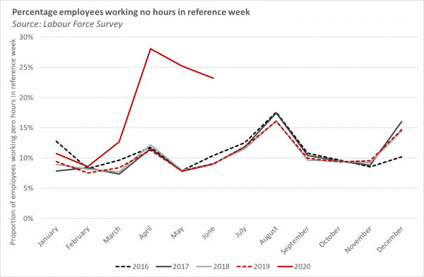
Clearly this excess rate of zero-hours working reflects the operation of the CJRS. But in itself it seems a poor measure of the proportion of employees furloughed.
The government’s official statistics indicate that almost nine million employees were furloughed in April and May, representing almost one third of all employees. In contrast, the proportion of employees in the LFS working zero hours reached around one quarter – although as noted this represents an ‘excess’ of only around 15 per cent of the workforce compared to normal.
What might explain the apparent discrepancy between the official estimates of the number of furloughed workers, and the rise in the proportion of employees working zero hours in the LFS? (Note that while the Q2 LFS did ask respondents whether they had been furloughed, this variable has not yet been released in the public datasets.)
Here are two possibilities:
- One factor that might account for a small element of the discrepancy is around second jobs. The chart above considers hours worked in an employee’s main job, ignoring the possibility that an employee could be furloughed from a second job. In reality however, relatively few people have more than one job[i].
- A more likely explanation is that some furloughed workers may have continued working. Some survey evidence has found that more than half of furloughed workers may have continued to work a positive number of hours per week; with workers on higher incomes and those with variable hours contracts being more likely to continue working, perhaps reflecting working autonomy and/or the ability to undertake some tasks from home.
So whilst the LFS – in the absence of an explicit variable to indicate a worker is on the CJRS – might not provide a reliable estimate of being furloughed, we can’t discount the possibility that it does nonetheless give a good indication of actual hours worked. And whilst the government’s statistics do breakdown the number of furloughed worker by sex, age and industry, the LFS remains the best way to get a handle on how hours worked have changed by occupation.
Changes in hours worked by occupation during lockdown – some examples
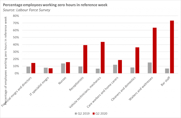
It goes without saying that the ‘lockdown’ affected occupations very differently. The chart below shows the proportion of employees in selected occupations who worked zero hours in the reference week, comparing Q2 2019 with Q2 2020.
In most occupations, the proportion of workers who worked zero hours was higher in 2020 than 2019, although for some, (nurses, care workers, financial managers), the difference was only slight. The proportion of IT managers who worked zero hours was actually lower in 2020 than in 2019.
Unsurprisingly, the lockdown had profound impacts on bar and waiting staff, over two thirds of whom worked no hours in 2020. A large minority of vehicle mechanics, receptionists and cleaners also worked zero hours in Q2 2020.
Occupational changes in hours worked – the big picture
What can we say about what has happened to the distribution of hours worked across all occupations?
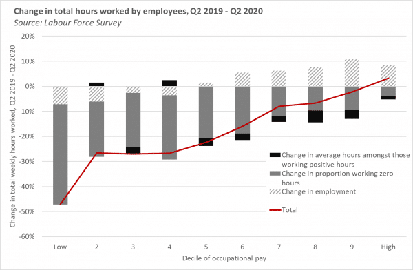
A common way of considering occupational change is to divide occupations into ten groups (deciles) ranked by the average hourly pay of that occupation. In the following analysis, we rank 369 occupations into deciles based on those occupations’ average hourly pay in 2019 (occupations are weighted by their employment in 2019). We then consider how actual hours worked in each decile have changed between Q2 2019 and Q2 2020.
There is a clear correlation between hourly pay and the change in total hours worked over the past year (see chart below). Total hours worked have fallen by almost 50% amongst the lowest paying occupations, and by over a quarter in deciles 2, 3 and 4. In contrast, hours worked have fallen less than 10% amongst deciles 7, 8 and 9, and have actually increased slightly amongst the highest paying occupations.
Changes in total hours worked in any given decile are a function of:
- The change in employment in the decile;
- The change in the proportion of employees who work zero hours;
- The change in the average hours worked by those who work positive hours.
Chart 3 decomposes the change in total hours into these three components.
The change in the proportion of employees working zero hours – a proxy for furloughing – explains the major part of the changes in total hours worked, particularly in lower paying deciles.
Additionally, employment has fallen in the lower deciles, contributing further to falls in hours worked, but employment has risen amongst the higher paying deciles, to an extent offsetting the effect of furloughing on total hours worked.
Changes in average hours worked amongst those working non-zero hours has not contributed much to the observed changes in total hours, but has contributed slightly to the reduction in hours worked in the top half of the occupational distribution.
Conclusions/ observations
The – so far – relatively stable headline number of employees masks unprecedented changes in the number of hours actually worked during the second quarter of 2020, and the distribution of those hours across occupations.
There is a strong correlation between an occupations’ average hourly pay and the decline in hours, with hours worked declining much more strongly in low paying rather than high paying jobs. This of course reflects the tendency of low-paying, customer service orientated occupations to be more affected by the economic restrictions.
How these changes affect earnings inequality during Q2 remains to be seen. This will depend in part on the extent to which furloughed workers’ pre-lockdown earnings are fully or partially made up in different parts of the distribution, with furlough payments capped at £2,500 per month (affecting around the highest paid quarter of employees).
More importantly, the question now turns to what happens next. The official CJRS statistics show that the number of furloughed workers was beginning to decline in June – with the labour market data tentatively suggesting that the majority of these workers were returning to employment rather than existing the furlough scheme to unemployment.
From July, employers can bring furloughed workers back to work part-time, with the CJRS topping up pay to pre-lockdown levels, so we might expect a gradual increase in actual hours worked, and potentially an increase in part-time working.
But from August the CJRS will gradually be withdrawn, before being ceased completely at the end of October. Big questions in the short-term include the extent to which furloughed workers will return to their existing jobs, how this will differ by occupation, the extent to which ongoing weakness in labour demand in some occupations will manifest as a reduction in employment or a reduction in hours worked, and the extent to which furloughed workers who are not brought back to work reallocate to other jobs, unemployment or inactivity. The answers in turn will have implications for inequality, and policies relating to social security, education and training.
[i] Between the first and second quarters of 2020, the number of people who worked as employees in a second job fell by around 10%, from 670,000 to 610,000, whilst the proportion of these working zero hours in a second job in the reference week rose from 12% to 32%. This implies that furlough rates for those working a second job are similar for those in a main job. There is no evidence in the data that people furloughed from a first job became more likely to take a second job in Q2 2020, although this question in reality, limited sample size prevents a conclusive story on this.
Authors

David is Senior Knowledge Exchange Fellow at the Fraser of Allander Institute